
Urdu
Urdu pages, signs and letters turned into text
Urdu is normally set in nastaliq, a script whose baseline steps diagonally down the line rather than running straight, so a word can hang below the letter before it rather than sit beside it. Evidano reads lithographed Urdu books, printed signage and forms, and fast personal handwriting, and sets the transcription beside the image so every dot and every stacked letter can be checked.
Sample pages
Source · Public domain · Sir Syed Ahmad Khan
Evidano Transcription
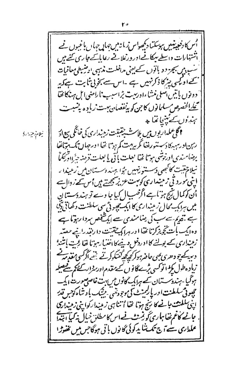
The paragraph completing a discussion of the 1857 uprising’s causes and the opening of the following section on zamindari land tenure, as proofread on Urdu Wikisource against this same page (proofread once, quality level 1 of 4 — not yet checked by a second proofreader). An editorial insertion marking a correction to the source text is kept as transcribed; wiki markup and category tags are removed.
اُس کا رفعیہ نہیں ہو سکتا دیکھو اس زمانہ میں جہاں جہاں باغیوں نے اشتہارات واسطے بہکانے اور ورغلانے رعایا کے جاری کئے ہیں \نہیں\ بجز دو باتوں کے یعنی مداخلت مذہبی اور ضبطی معاقیات کے اور کسی چیز کا ذکر نہیں ہے۔ اس سے بخوبی ثابت ہے کہ یہ دونوں باتیں اسلی منشاء اور بہت بڑا سبب ناراضی اہل ہند کا تھا علے الخصوص مسلمانوں کا جن کو یہ نقصان بہت زیاده بنسبت ہندؤوں کے پہنچا تھا۔
نیلام زمینداری
اگلی عملداریوں میں بلاشبہ حقیقت زمینداری کی خانگی بیع اور رین اور ہبہ کا دستور تھا مگر یہ بہت کم ہوتا تھا اور جہاں تک ہوتا تھا برضامندی اور خوشی ہوتا تھا بعلت باقی یا بعلت قرضہ جبراً اور تحکماً نیلام حقیت کا کبھی دستور نہیں ہوُا۔ ہندوستان میں زمیندار اپنی موروثی زمینداری کو بہت عزیز سمجھتے ہیں اُس کے زوال سے اُن کو کمال رنج ہوتا ہے۔
Source: صفحہ:Asbab-e-Baghawat-e-Hind.pdf/29, Urdu Wikisource (Public domain).
World Digital Library, via Wikimedia Commons, 1920 · Source · Public domain · Abul Hasanāt Nadvi
Evidano Transcription
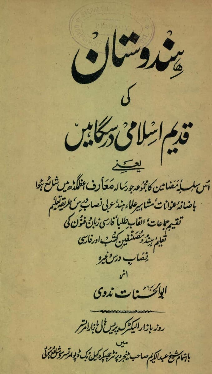
[stamp: STEPHENSO[N] LIBRARY GOVERNMENT [COLL]EGE LAHORE]
ہندوستان
کی
قدیم اسلامی درسگاہیں
یعنے
اُس سلسلۂ مضامین کا مجموعہ جو رسالہ مَعارف اعظمگڈھ میں شائع ہُوا
باضافۂ عنوانات، مشاہیر علماء ہند، عربی نصاب درس، طریقہ تعلیم
تقسیم جماعات، القاب طلبا، فارسی زبان و فنون کی
تعلیم، ہندو مُصنّفین کتب اور فارسی
نصاب درس وغیرہ
از
ابوالحسنات ندوی
روزہ بازار الیکٹرک پریس ہال بازار امرتسر
میں
باہتمام شیخ عبدالکریم صاحب مینجر و پرنٹر چھپکر وکیل بک ڈپو امرتسر سے شائع ہُوئی
Generated by Evidano’s advanced model; not yet checked against a published edition.
Source · CC BY-SA 4.0 · VoidBaba
Evidano Transcription
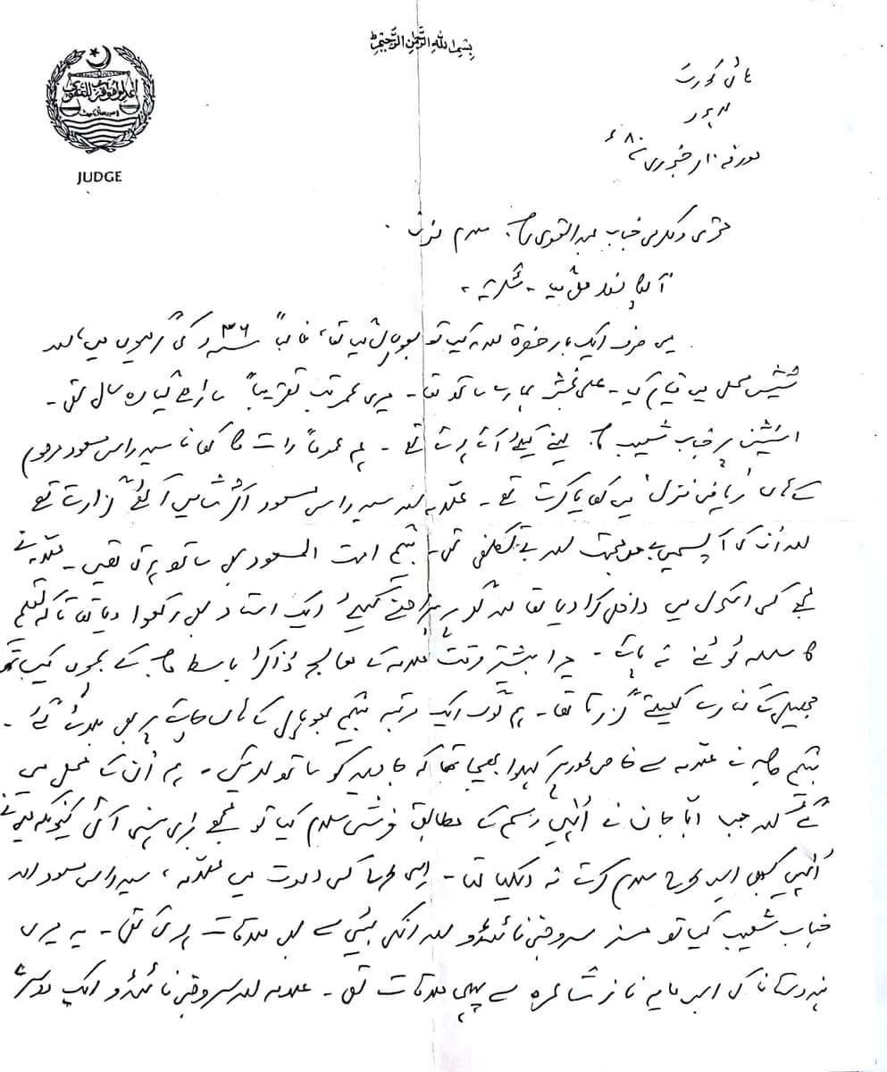
[emblem]
JUDGE
بسم اللہ الرحمٰن الرحیم
ہائی کورٹ
لاہور
مورخہ ۱۱ فروری ۸۰ء
محترمی و مکرمی جناب عبدالقوی صاحب، سلام مسنون ۔
آپکا خط ملا ہے ۔ شکریہ ۔
میں صرف ایک بار حضرت والد کے ساتھ بھوپال گیا تھا، غالباً ۳۶ء کی گرمیوں میں والد[?]
شیش محل میں قیام کیا ۔ علی بخش ہمارے ساتھ تھا ۔ میری عمر تب تقریباً ساڑھے گیارہ سال تھی ۔
اسٹیشن پر جناب شعیب ص[?] لینے کیلئے آئے ہوئے تھے ۔ ہم عموماً رات کا کھانا سر[?] راس مسعود مرحوم
کے ہاں 'ریاض منزل' میں کھایا کرتے تھے ۔ علامہ اور سر[?] راس مسعود اکثر شامیں اکٹھے گزارتے تھے
اور اُن کی آپس میں بے حد محبت اور بے تکلفی تھی ۔ بیگم امتہ المسعود بھی ساتھ ہوتی تھیں ۔ علامہ نے[?]
مجھے کسی اسکول میں داخل کرا دیا تھا اور گھر پر پڑھانے کیلئے ایک استاد بھی رکھوا دیا تھا تاکہ تعلیم
کا سلسلہ ٹوٹنے نہ پائے ۔ میرا بیشتر وقت علامہ کے معالج ڈاکٹر باسط صاحب کے بچوں کے ساتھ
[illegible] کھیلتے[?] گزرتا تھا ۔ ہم لوگ ایک مرتبہ بیگم بھوپال کے ہاں چائے پر بھی[?] بلائے[?] گئے ۔
بیگم صاحبہ نے علامہ سے خاص طور پر کہلوا بھیجا تھا کہ جاوید کو ساتھ لائیں ۔ ہم اُن کے محل میں
گئے اور جب ابا جان نے اُنہیں رسم کے مطابق فرشی سلام کیا تو مجھے بڑی ہنسی آئی کیونکہ میں نے
اُنہیں کبھی اس طرح سلام کرتے نہ دیکھا تھا ۔ ایسی طرح کی دعوت میں علامہ، سر[?] راس مسعود اور
جناب شعیب کے ساتھ مسز سروجنی نائیڈو اور انکی بیٹی سے بھی ملاقات ہوئی تھی ۔ یہ میری
ہندوستان کی اس نامور شاعرہ سے پہلی ملاقات تھی ۔ علامہ اور سروجنی نائیڈو ایک دوسرے
Generated by Evidano’s advanced model; not yet checked against a published edition.
Source · CC BY-SA 4.0 · JogiAsad
Evidano Transcription
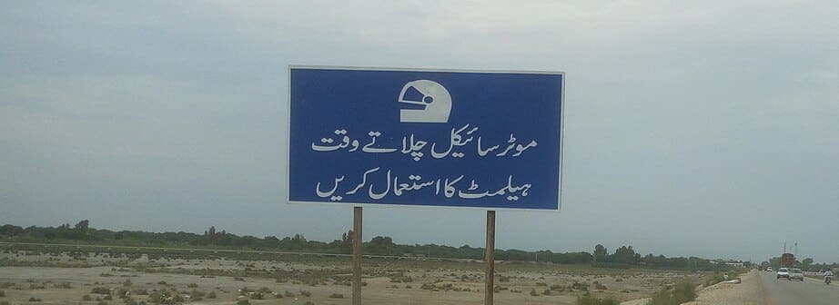
موٹرسائیکل چلاتے وقت
ہیلمٹ کا استعمال کریں
Generated by Evidano’s advanced model; not yet checked against a published edition.
What Urdu text looks like on the page
Urdu grew out of the everyday Hindustani of Delhi and its region into a distinct literary language among the poets of eighteenth- and nineteenth-century Delhi and Lucknow, and was adopted as an official court language of much of North India in the Perso-Arabic script it still uses. That created a printing problem nastaliq never really solved: unlike naskh, the upright script used to set Arabic and most Persian type, nastaliq’s sloping baseline and heavy ligatures do not sit comfortably in a grid of movable type. For most of Urdu’s printed history, a newspaper page or a book was not set in type at all but hand-lettered by a professional calligrapher, a kātib, and then photographed and printed by lithography; digital nastaliq fonts only became workable from the 1980s, and some publications kept a kātib on staff well after that.
The alphabet is the Perso-Arabic one extended for South Asian sounds: retroflex consonants absent from Arabic and Persian get their own letters, ٹ, ڈ and ڑ, and the two-eyed hē, ھ, marks the aspirated stop series (بھ، پھ، تھ …) that Hindi-Urdu needs and Arabic does not. Many letters share one underlying shape and are told apart only by the number and placement of dots above or below it — ب، پ، ت، ٹ and ث are one shape with different dotting, and so are ج، چ، ح and خ — and short vowels are normally left unwritten, so a reader supplies them from context rather than from the page.
Nastaliq itself compounds this: the line of writing steps downward from right to left rather than running level, bowl-shaped letters such as و and ر hang below the notional baseline, and certain letter pairs merge into a single compound ligature rather than staying as two distinct shapes. A handwritten letter pushes this further still, with the diagonal drop exaggerated, dots reduced to a stroke or omitted, and whole words compressed into a fast, personal shorthand very different from a katib’s formal hand.
Why ordinary OCR struggles here
A baseline that steps down the line
Nastaliq does not run along one horizontal row the way naskh or a Latin typeface does; a word can start high and cascade down to the left, with a following bowl letter dipping well below where the last letter sat. Software that expects text to sit on a single line misaligns the letters or joins two words into one.
Letters that differ only by their dots
A soft scan, a worn lithograph or a fast hand can lose or shift the dots that are the only difference between ب, پ, ت, ٹ and ث, or between ج, چ, ح and خ. Reading the letter right means reading the dots right, not just the base shape they sit on.
Short vowels the page never wrote
Ordinary Urdu print and handwriting leaves short vowels unmarked, so the same string of consonants can be more than one word. Getting this right depends on recognising the word as a whole against context, not on reading each letter in isolation.
Print that is really a calligrapher’s handwriting
A lithographed book or newspaper page was drawn by a kātib, not set from uniform metal type, so the “same” letter varies slightly every time it recurs on the page and again from one issue to the next. A model trained on a single consistent typeface can be thrown by this natural variation.
Who works with this material
Newspaper and periodical archives
Decades of Urdu papers were hand-lettered by kātib before digital nastaliq fonts existed, so a digitisation project has to read genuinely handwritten “type” that varies from issue to issue, not a fixed font.
Family, legal and land-record archives
Personal letters, land deeds and old legal papers are written in fast, informal hands on official letterhead or stamped paper, and researchers need names, dates and place names read correctly even where dotting is light or inconsistent.
Government and educational publishing
Textbook boards and government departments produce Urdu-medium material that mixes Urdu prose with English technical terms, numerals and headings, and need the two kept distinct rather than merged into one script.
Heritage and signage documentation
Mosques, shops, milestones and public notices carry Urdu lettering in styles ranging from careful nastaliq to plain print, and a survey or catalogue needs an accurate reading of each rather than an approximate guess from a photograph taken at an angle.
Getting the best transcription
Say which style of Urdu the page uses
Tell the model whether the material is literary nastaliq, a plainer print style closer to naskh, or personal handwriting, so it applies the right expectations for baseline slope and ligatures rather than one fixed model of the script.
Ask for uncertain dots to be flagged, not guessed
On a soft scan or a worn lithograph, ask for genuinely ambiguous dot placement to be marked rather than silently resolved one way, since a missed dot changes the letter and can change the word.
Decide how to handle unwritten short vowels
Say whether you want the text exactly as printed, with short vowels left out the way the source leaves them, or with vowel points added for a reading aid — the two serve different purposes and are worth keeping separate.
Start with the hardest hand in the batch
Run a fast personal letter before a run of uniform print. If the model correctly separates a cascading, lightly dotted hand into its words, the rest of a lithographed book or a clean sign needs only a light check.
Frequently asked questions
- Does it read nastaliq’s diagonal baseline, or does it expect a straight line like Arabic naskh?
- Nastaliq’s stepped baseline and letters that dip below the line are read as part of the script’s own structure, not forced onto a straight-line model built for naskh or Latin type.
- How does it tell apart letters that look identical except for their dots?
- Dot count and placement are read as the distinguishing feature they are, and where a scan genuinely leaves the dotting ambiguous, that uncertainty is flagged rather than resolved by a silent guess.
- Will it add short vowels that were not in the original?
- Not unless you ask for them. The default keeps the text exactly as written, unpointed where the source is unpointed; vowel points can be added as a separate, clearly optional pass.
- Can it read an old lithographed book where the “print” is a calligrapher’s handwriting?
- Yes. A kātib’s hand-lettered page is read as the handwriting it is, including the natural variation between one occurrence of a letter and the next, rather than expected to match a single uniform font.
- Does it handle Urdu numerals and English terms mixed into the same page?
- Yes. Urdu-Indic numerals and any English words, headings or technical terms are transcribed in place, kept distinct from the surrounding Urdu rather than folded into one script.
- Can it read a personal letter in a fast, informal hand?
- Fast handwriting with a steep diagonal drop and light or missing dots is read as that hand, though a genuinely illegible word is marked rather than guessed at outright.
Related scripts and pages
Transcribe your Urdu documents
Upload a scan or a photograph — a book page, a letter, a form or a sign — and check the Urdu transcription line by line before you export it.