
English
Read the words on signs, packs and printed sheets
Text that is meant to be looked at behaves differently from text meant to be read. A sign puts four sizes of lettering on one board and expects you to take them in a particular order; a food pack hides the useful part — allergens, a use-by date, a batch code — in four-point type on a curved surface; a newspaper page runs seven columns under a headline that belongs to only one of them. Evidano keeps that hierarchy instead of flattening it into a list of words.
Sample pages
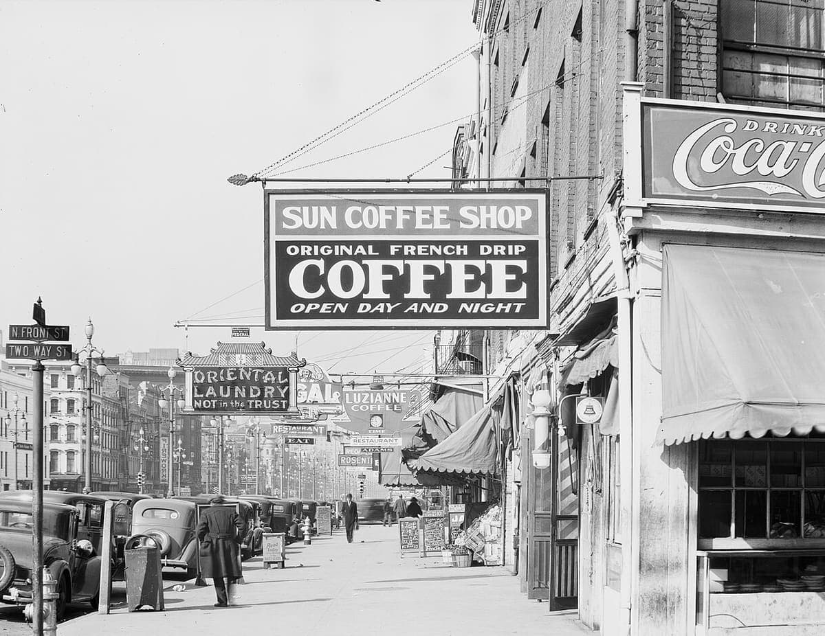
Library of Congress, Farm Security Administration collection, December 1935 · Source · Public domain · Photograph by Walker Evans
Evidano Transcription
N. FRONT ST
TWO WAY ST
[illegible]
FEDERAL
ORIENTAL
LAUNDRY
NOT in the TRUST
SUN COFFEE SHOP
ORIGINAL FRENCH DRIP
COFFEE
OPEN DAY AND NIGHT
GAL
LUZIANNE
COFFEE
RESTAURANT
EAT
TIME
RESTAURANT
REG. ADAMS
ROSENT[illegible]
DRINK
Coca-C[illegible]
Read
Today
Generated by Evidano’s advanced model; not yet checked against a published edition.
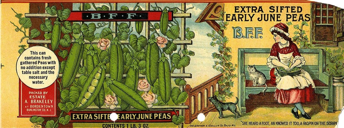
US National Archives and Records Administration, between 1906 and 1946 · Source · Public domain
Evidano Transcription
· B · F · F ·
This can
contains fresh
gathered Peas with
no addition except
table salt and the
necessary
water.
PACKED BY
ESTATE
A. BRAKELEY
AT BORDENTOWN
BURLINGTON CO. N. J.
EXTRA SIFTE[supplied: D] EARLY JUNE PEAS
CONTENTS 1 LB. 3 OZ.
2343
EXTRA SIFTED
EARLY JUNE PEAS
B.F.F.
THE SIMPSON & DOELLER CO. BALTO. MD.
"SHE HEARD A FOOT, AN KNOWED IT TOO, A RASPIN ON THE SCRAP[illegible]
Generated by Evidano’s advanced model; not yet checked against a published edition.
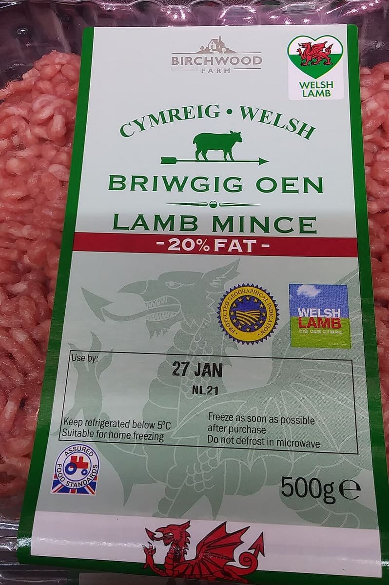
Source · CC BY-SA 4.0 · Photograph by Wikimedia Commons user Stefanik
Evidano Transcription
BIRCHWOOD
FARM
WELSH
LAMB
CYMREIG • WELSH
BRIWGIG OEN
LAMB MINCE
- 20% FAT -
PROTECTED GEOGRAPHICAL INDICATION
WELSH
LAMB
CIG OEN CYMRU
Use by:
27 JAN
NL21
Keep refrigerated below 5°C Freeze as soon as possible
Suitable for home freezing after purchase
Do not defrost in microwave
ASSURED
FOOD STANDARDS
500g e
Generated by Evidano’s advanced model; not yet checked against a published edition.
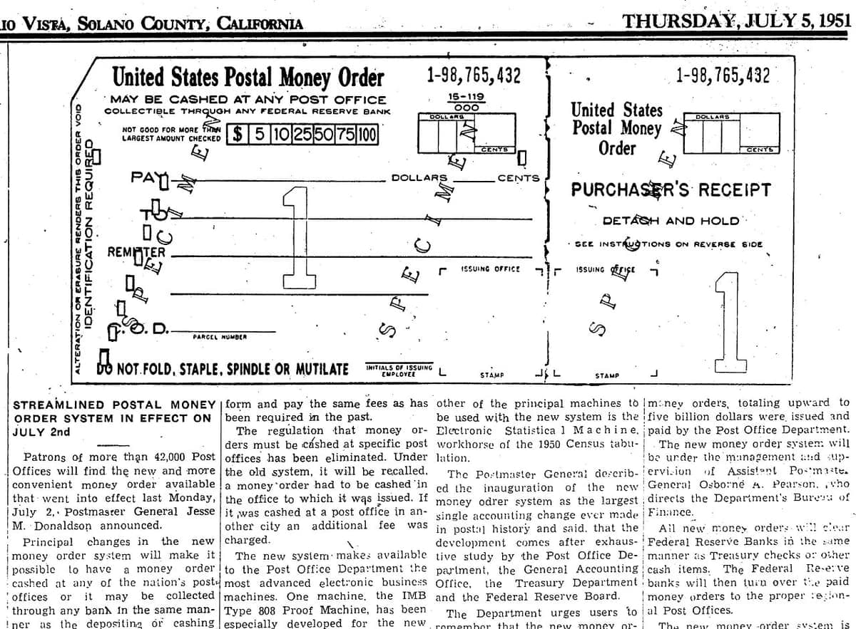
Source · Public domain · United States Post Office Department, printed in the River News Herald
Evidano Transcription
IO VISTA, SOLANO COUNTY, CALIFORNIA THURSDAY, JULY 5, 1951
ALTERATION OR ERASURE RENDERS THIS ORDER VOID
IDENTIFICATION REQUIRED
United States Postal Money Order 1-98,765,432 1-98,765,432
MAY BE CASHED AT ANY POST OFFICE 15-119
COLLECTIBLE THROUGH ANY FEDERAL RESERVE BANK 000
DOLLARS United States DOLLARS
NOT GOOD FOR MORE THAN $ 5 10 25 50 75 100 Postal Money
LARGEST AMOUNT CHECKED CENTS Order CENTS
PAY DOLLARS CENTS PURCHASER'S RECEIPT
S P E C I M E N S P E C I M E N
TO DETACH AND HOLD
REMITTER SEE INSTRUCTIONS ON REVERSE SIDE
ISSUING OFFICE ISSUING OFFICE
C. O. D.
PARCEL NUMBER
DO NOT FOLD, STAPLE, SPINDLE OR MUTILATE INITIALS OF ISSUING
EMPLOYEE STAMP STAMP
STREAMLINED POSTAL MONEY ORDER SYSTEM IN EFFECT ON JULY 2nd
Patrons of more than 42,000 Post
Offices will find the new and more
convenient money order available
that went into effect last Monday,
July 2, Postmaster General Jesse
M. Donaldson announced.
Principal changes in the new
money order system will make it
possible to have a money order
cashed at any of the nation's post
offices or it may be collected
through any bank in the same man-
ner as the depositing or cashing
form and pay the same fees as has
been required in the past.
The regulation that money or-
ders must be cashed at specific post
offices has been eliminated. Under
the old system, it will be recalled,
a money order had to be cashed in
the office to which it was issued. If
it was cashed at a post office in an-
other city an additional fee was
charged.
The new system makes available
to the Post Office Department the
most advanced electronic business
machines. One machine, the IMB
Type 808 Proof Machine, has been
especially developed for the new
other of the principal machines to
be used with the new system is the
Electronic Statistical Machine,
workhorse of the 1950 Census tabu-
lation.
The Postmaster General describ-
ed the inauguration of the new
money odrer system as the largest
single accounting change ever made
in postal history and said, that the
development comes after exhaus-
tive study by the Post Office De-
partment, the General Accounting
Office, the Treasury Department
and the Federal Reserve Board.
The Department urges users to
remember that the new money or-
money orders, totaling upward to
five billion dollars were issued and
paid by the Post Office Department.
The new money order system will
be under the management and sup-
ervision of Assistant Postmaster
General Osborne A. Pearson, who
directs the Department's Bureau of
Finance.
All new money orders will clear
Federal Reserve Banks in the same
manner as Treasury checks or other
cash items. The Federal Reserve
banks will then turn over the paid
money orders to the proper region-
al Post Offices.
The new money order system is
Generated by Evidano’s advanced model; not yet checked against a published edition.
What counts as a sign or a label
This covers fascias and hanging signs, street name plates, wayfinding and regulatory signs, notices taped inside a window, menus and chalkboards, posters and handbills, tickets and vouchers, and every kind of packaging from a tin label to a blister pack. It also covers ordinary printed sheets — a newspaper page, a leaflet, a set of instructions — where the interest is the layout as much as the words. What unites them is that the design carries meaning: what is biggest is the name, what is in the red band is the claim, what is in the box at the bottom is the legal small print.
The typography is deliberately awkward. Display lettering is drawn rather than typeset, condensed or expanded to fill a board, set in capitals, arched round a curve, reversed out of a dark panel or given a shadow. Numbers arrive as prices with a currency sign, as weights with units and the estimated-quantity mark ℮, as percentages in a flash, and as date codes that mean nothing outside the factory that printed them. Logos contain words that are part of the brand — and symbols that are not words at all, such as the recycling triangle, the wheelie bin or a country flag. On packaging two languages often sit on the same panel, alternating line by line.
Then the photograph gets in the way. Signs are read at an angle from the pavement, so lettering foreshortens and the far end of a fascia is half the height of the near end; glass and gloss paint throw the sky back at the camera; a hanging sign is cut off by the edge of the frame or by a passing lorry. Packaging curves away, so the ingredients list bends out of focus, and a chiller cabinet adds its own reflections. Street scenes contain a dozen signs at different distances, most of them too small to read, and it matters that a transcript says which ones those are.
Why ordinary OCR struggles here
Size and position are the reading order
A board that reads SUN COFFEE SHOP, then ORIGINAL FRENCH DRIP, then COFFEE in the largest letters, then OPEN DAY AND NIGHT is one message in four bands. Sorted by size, or read strictly top to bottom without grouping, it turns into disconnected phrases that no longer name a business.
Small print is where the facts are
Allergens, storage instructions, net weight, a use-by date and a batch code are set at a fraction of the size of the brand name, often in low contrast over a tint. That is exactly the text people need out of a photograph of a pack, and exactly the text that a downscaled snapshot loses first.
Letters that are not letters, and letters inside pictures
A logo may be a monogram, a device or a word drawn as a picture; a quality mark carries text inside a roundel; a symbol such as ℮ or ♻ sits in the line like a character. Deciding what is a word, what is a mark to be named and what is ornament is a judgement about design, not about shapes.
Angles, glare and everything cut off
Photographs of signage are taken from below and to one side, through glass, in sunlight. Perspective narrows one end of the text, reflections erase a line, and the frame slices words at the edge. A transcript that silently completes a half-visible word is worse than one that marks it as cut off.
Who works with this material
Retail and packaging teams
Artwork proofs, competitor packs and shelf photographs all need their copy in text: claims, weights, allergen statements and the words inside every mark. Getting them out of a photograph is faster than retyping and keeps the wording exactly as printed.
Accessibility and translation projects
Signs and labels are where people get stuck in an unfamiliar place or an unfamiliar language. Reliable text is the raw material for a spoken description or a translation, and it has to include the small print, not just the headline.
Surveyors, inspectors and asset teams
Site photographs carry plant plates, safety notices, test labels and meter readings. Pulling the model number, the serial and the inspection date off a plate photographed at arm’s length in bad light is the whole job.
Historians of the built environment and advertising
Street photographs are evidence of who traded where and what they charged. Transcribing the fascias, painted walls and window bills in a set of photographs turns a picture collection into something searchable by name and by trade.
Getting the best transcription
Frame the whole sign, then go closer
Take one photograph that includes every edge of the board or panel, then a second of the small print from close up and square on. The wide shot fixes the layout and the close shot gives the characters; together they do what neither can alone.
Ask for the hierarchy, not just the words
Request the text grouped by panel or band, with a note of relative size and colour, and with any logo reported as a mark plus the words inside it. That is what lets you rebuild the sign, or compare two packs, instead of holding a bag of phrases.
Name the fields you actually need
On packaging, say that you want the product name, net quantity, use-by date, batch code, allergens and country of origin as separate fields. Those are the parts that get checked, and asking for them by name is what stops them being buried in a paragraph of marketing copy.
Deal with curve, glare and perspective at the camera
Turn the pack so the panel faces you, move a step to the side to lose the reflection, and photograph a fascia from as close to square on as the pavement allows. A minute spent moving beats any amount of processing afterwards.
Frequently asked questions
- Are prices and units kept exactly as printed?
- Yes — the currency sign, the decimal point, the unit and any qualifier such as per kg or ℮ are transcribed as they appear. Nothing is converted between currencies or unit systems unless you ask for it separately.
- What happens to logos and symbols?
- Words inside a logo are transcribed and the mark itself can be named — a recycling triangle, a quality seal, a flag — so that a pack description is complete. Purely decorative devices are described briefly rather than turned into letters.
- Can it read a sign photographed at an angle?
- Usually, within reason. Moderate perspective is handled; an extreme angle, where the far end of the lettering is a few pixels high, is not, and in that case the unreadable part is reported as unreadable rather than guessed at.
- How is a bilingual label handled?
- The two languages can be separated and labelled, so that the Welsh and the English, or the English and the French, come back as parallel fields rather than as alternating lines of one confused paragraph.
- Will the small print on packaging come out?
- It depends entirely on the photograph. Allergen and storage text is often smaller than two millimetres, so it needs a close, well-lit, square-on shot; from a general picture of the shelf it will be marked as present but illegible.
- Can several signs in one street photograph be listed separately?
- They can, each with its own text and a note of where it sits in the frame, which is more useful than a single block. Signs too distant or too foreshortened to read are listed as such rather than being invented from context.
Related scripts and pages
Get the text off a sign or a pack
Upload a photograph of a shopfront, a notice, a label or a printed sheet, choose Signs, Labels and Printed Materials, and name the fields you need pulled out.