
French · c. 1200–1400
Read the compressed Gothic book hand of medieval France
Thirteenth- and fourteenth-century French scribes wrote narrow, broken letters packed into ruled columns, and the reader has to count strokes to tell a minim from a minim. Add a rubricated running title, a gloss in a smaller module and an abbreviation bar over every second word, and a page of the Bible historiale becomes a puzzle of shapes rather than a text. Evidano transcribes these columns line by line and marks what it has expanded.
Sample pages
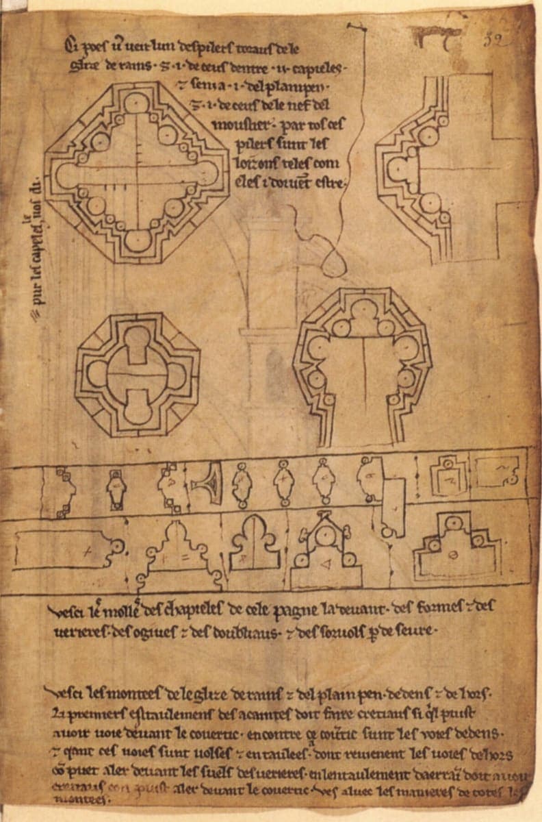
Bibliothèque nationale de France, MS fr. 19093, f. 32, c. 1225–1235 · Source · Public domain
Evidano Transcription
The three prose captions on the leaf, in the reading printed with the 1906 phototype facsimile of the album: abbreviations are expanded, the Tironian ⁊ is printed as et, the roman numerals are kept as the scribe wrote them, and punctuation and accents are the editor’s. The first two captions describe the drawings on this leaf; the third, at the foot of the page, introduces the elevations drawn overleaf and is printed with them in the edition. Line breaks follow the sense, not the manuscript.
Ci poés vos veir l’un des pilers toraus de le glize de Rains, et i. de ceus d’entre ij. capieles, et s’en i a i. del plain pen, et i. de ceus de le nef del moustier. Par tos ces pilers sunt les loizons teles come eles i doivent estre.
Vesci les molles des chapieles de cele pagne la devant des formes et des verieres, des ogives et des doubliaux et des sorvols par deseure.
Vesci les montées de le glize de Rains et del plain pen dedens et dehors. Li premiers estavlemens des açaintes doit faire cretiaus, si qu’il puist avoir voie devant le covertic. Encontre ce covertic sunt les voies dedens, et qant ces voies sunt volses et entavlées, adont reviennent les voies dehors, c’on puet aler devant les suels des verieres ; en l’entavlement daerrain doit avoir cretiaus, c’on puist aler devant le covertic. Vés aluec les manieres de totes les montées.
Source: Henri Omont (ed.), Album de Villard de Honnecourt, architecte du XIIIe siècle: reproduction des 66 pages et dessins du manuscrit français 19093 (Paris, 1906), pl. LXIII–LXIV, via Internet Archive (Public domain).
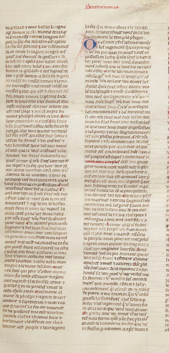
Bibliothèque nationale de France, MS fr. 155, f. 48, c. 1310–1320 · Source · Public domain
Evidano Transcription
Left column only; the model’s reading of the right column broke down, so it is left out.
Deuteronomes.
de galaad ⁊ tout basan leregne
og/ donai ie ala moitie de lalig
nie manasse ⁊ toute laregion dar
gob/ la q̃le t̃re debasan est apelee
la t̃re des geianz· Jair li filz manas
se ot toute la region dargob ius
ques aus t̃rmes de gessuri ⁊ de
machati ⁊ apela jair basan aioch
jair/ c'est adire viles jair. Amachiꝛ
donnai ie galaad. ⁊ aus lignies ru
ben ⁊ gad donnai ie de la t̃re de gala
ad iusqu'au ruissel darnon ⁊ lamoi
tie du ruissel ⁊ des getees iusqu'au
ruissel jaboc qui est li t̃rmes des
filz amon/ ⁊ toute la plaine dudese
rt de iourdan ⁊ les t̃rmes de cene
reth iusques ala mer de serte qui
est t̃res salee ⁊ iusqu'au pie du
mont phasga deuar orient .i. don[c]
leur cõmandai ie ⁊ dis· nre sires
vostre diex vous a done ceste t̃re en he
ritage. Alez done deuant vos freres
les filz ysrl' qui estes forz homes ⁊
lessies vos fames ⁊ vos enfanz ⁊
vos batailles dont vos auez mout
es citez que ie vous ai donees ius\
que nre [sires] done vos freres en bataille ius
ques a tant qu'il aist asis lor cuer co[me]
il a asis le vostre/ ⁊ la t̃re qu'il lor doit do
ner outre iourdan amsi com il v[ous]
adonee de ca iourdan. ⁊ done re
tornerez vos touz en la t̃re queie
vous ai donee en possession. En ce[l]
meismes tens dis ie a iosue· Ti
oeil ont veu ce qu'nre sires nre diex
a fait a ceus .ij. rois seon leroi des
amorieus ⁊ og leroi debasan
ainsi fera il a touz les regnes la
ou tu iras. ⁊ ine les dote riens
car nre sires vre diex se cõbatra
por vous. En cel tens proiai ie nre
seigneur ⁊ dis biaus sire diex tu as
cõmencie amonstrer aton sergant
ta g̃ndeur ⁊ ta force main n'en n'u[l]
autres diex n'est ne en ciel ne en t̃re
qui puist faire tes euures ne e[s]t̃re
a parex a ta force. passerai ie don[c]
la t̃re ⁊ verrai ceste t̃re tres bõne
outre iourdan ⁊ ceste noble mon
taigne ⁊ le mont deliban. Quant
nre sires qui pour v' estoit courc[iez]
amoi. il eust ostãdee mapriere
ainsi medist· il te soufise actne ⁊
g̃rdes qu tu ne paroles iames de
ceste chose amoi. mais monte e[n]
mont de phasga ⁊ regarde deuers
occident ⁊ septentrion ⁊ midi ⁊ ori
ent ⁊ revoies la t̃re car vraiement
tu ne passeras mie cest iourdan
õmande a iosue ⁊ li done force ⁊
hardement ⁊ le cõforte car ilira
deuant cest peiple ⁊ leur departira
Generated by Evidano’s advanced model; not yet checked against a published edition.
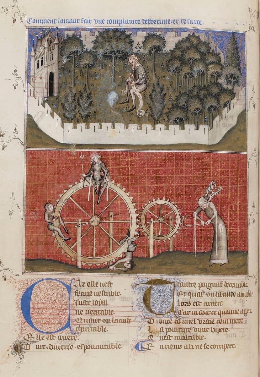
Bibliothèque nationale de France, MS fr. 1586, c. 1350–1356 · Source · Public domain
Evidano Transcription
The verse under the miniatures, printed as lines 921–933 of the Remede de Fortune in Hoepffner’s edition; the scribe breaks the first two of them at the caesura, so thirteen printed verses fill fifteen ruled lines. The editor supplies punctuation, accents and apostrophes, and his apparatus records that this manuscript reads Traistre where the text prints Traître. The red rubric above the miniature is not part of the edited text.
Car elle n’est ferme n’estable,
Juste, loyal, ne véritable;
Quant on la cuide charitable,
Elle est avère.
Dure, diverse, espouentable,
Traître, poignant, decevable ;
Et quant on la cuide amiable,
Lors est amere.
Car ja soit ce qu’amie appere,
Douce com miel, vraie com mère,
La pointure d’une vipère
Qu’est incurable
En riens a li ne se compère,
Source: Ernest Hoepffner (ed.), Œuvres de Guillaume de Machaut, tome II (Société des anciens textes français, Paris, 1911), Remede de Fortune, ll. 921–933, via Internet Archive (Public domain).
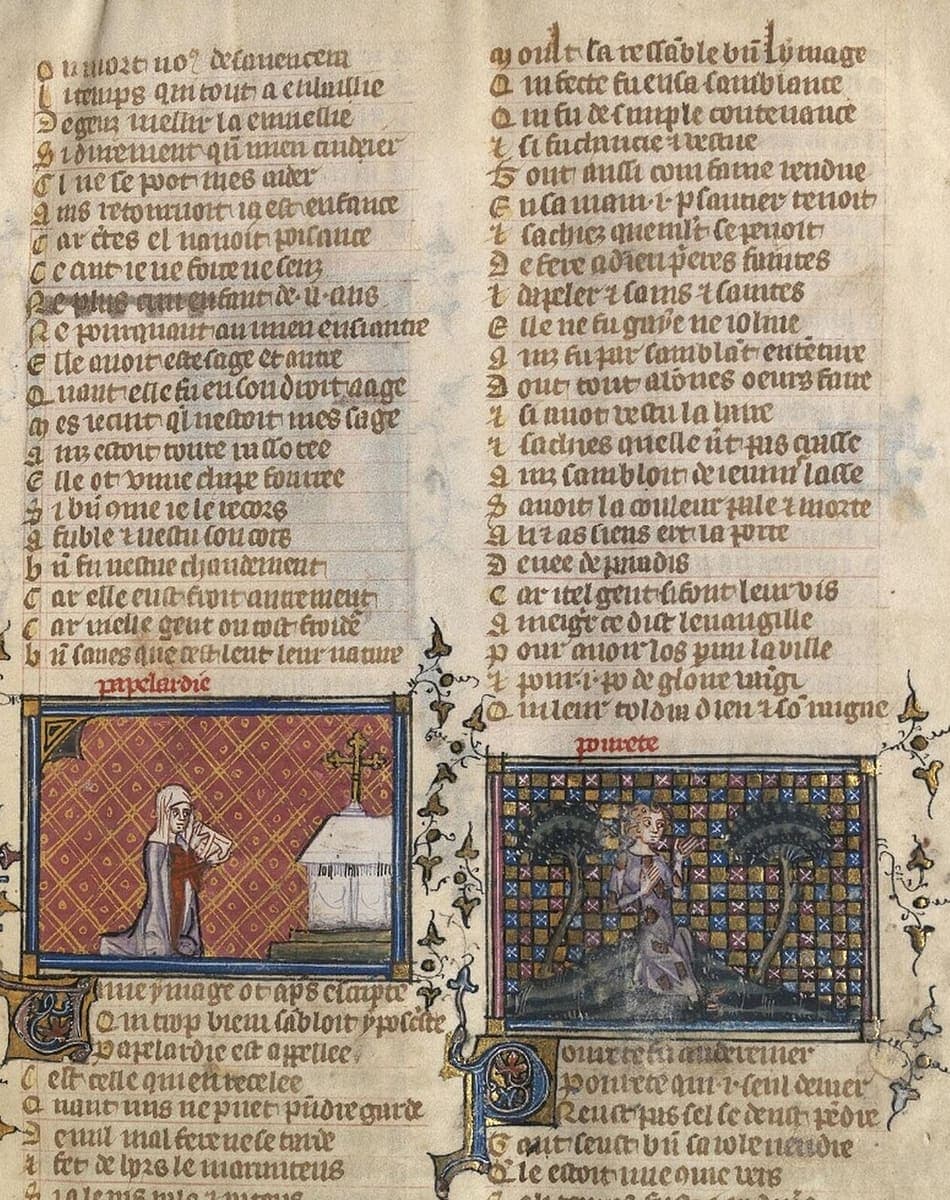
National Library of Wales, MS 5016D, f. 5, Fourteenth century · Source · CC0 1.0
Evidano Transcription
Ou mort no[us] desauencera
Li temps qui tout a enuiellie
Degriz[?] uiellir la enuiellie
Si durement q[u]il men audier[?]
Cl[?] ne se pot mes aider
Ains retornoit ia[?] est enfance
Car e[n]tes el nauoit poisance
Ce cuit ie ne force[?] ne senz[?]
Ne plus c[u]n enfant de .ii. ans
Ne porquant au mien esciantre
Elle auoit este sage et aiue[?]
Quant elle fu en son droit aage
Mes ie cuit qi nestoit mes sage
Ainz estoit toute rasotee[?]
Elle ot vnne chape fourree
Si bi[e]n co[m]me ie le recors
Afuble [et] uestu son cors
Bi[e]n fu uestue chaudement
Car elle eust froit autrement
Car uielle gent ont tost froide[?]
Bi[e]n saues que cest leur leur nature
papelardie
Vnne ymage ot ap[re]s escripte
Qui trop bien sambloit ypocrite
Papelardie est appellee
Cest celle qui en recelee
Quant nus ne puet p[re]ndre garde
De nul[?] mal fere ne se tarde
Et fet de lors[?] le marmiteus
[cut off]
Moult[?] la ressable vn ymage
Qui fecte fu en sa samblance
Qui fu de simple contenance
Et si fu chauciee [et] uestue
Tout aussi com fame rendue
En sa main .i. psautier tenoit
Et sachiez que m[ou]lt se penoit
De feire a dieu p[ri]eres feintes[?]
Et dapeler [et] sains [et] saintes
Elle ne fu gaie ne ioliue
Ainz fu par sambla[n]t ente[n]tiue
Dou tout a bo[n]nes[?] oeurs faire
Et si auoit uestu la haire[?]
Et sachies quelle n[']ert pas grasse
Ainz sambloit de ieuner lasse
Sauoit la couleur pale [et] morte
A li [et] as siens ert la porte
Deuee de paradis
Car itel gent si[?] font leur uis
Amegrir ce dist leuangille
Pour auoir los p[ar]mi la ville
Et pour .i. po de gloire uaine[?]
Qui leur toldra dieu [et] so[n] regne
pourete
Pourete fu au derrenier
Pourete qui .i. seul denier
Neust pas sel se deust p[en]dre
Tant seust bi[e]n sa robe uendre
Q[ue]le estoit nue co[m]me uers
[cut off]
Generated by Evidano’s advanced model; not yet checked against a published edition.
What French textualis looks like on the page
From about 1200 the rounded proto-Gothic letters of the twelfth century harden into littera textualis: shafts of even width, feet turned by the pen rather than curved, curves that bite into the letter next to them so that bo, de and pp share a stroke. French copies of the romances, the vernacular Bible and the courtly lyric use its lighter grades, littera textualis and textualis currens, while the grand Parisian workshops of the fourteenth century use the formata with its diamond feet. Round r follows o, b, p and h; round final s stands beside the tall ſ; the two-storey a keeps a closed upper bow; and i is written without a dot, which is what turns minim, uenu and iumine into guesswork.
Abbreviation is inherited from Latin but applied to French words. A bar cuts n or m (cõme, nō), a hooked ꝑ stands for par or per and ꝕ for pro, a superscript vowel supplies the syllable (qͥ for qui, mͥ for mi), the Tironian ⁊ does duty for et, and the crossed q covers que. French adds its own habits: the -us hook on final -x, apocopated forms such as g̃nt for grant, and the -ez ending written with a z that looks like a long tail. Numerals are roman, flanked by full stops and often with a superscript stroke, so .xij. and .ixˣˣ. sit in the middle of a sentence.
Layout carries as much meaning as the letters. Verse is ruled one line to a verse with the initial letter set out in a narrow ruled column of its own, often touched with red; prose runs in two or three columns with red and blue pen-flourished initials, paragraph marks and running titles naming the book. Rubrics in red announce chapters, glosses are copied in a smaller module beside the text they explain, and corrections are added between the lines. Two centuries of readers then wrote in the margins in later hands, so a single page can carry three or four scripts of different dates.
Why ordinary OCR struggles here
Minim strings with no dots
A word such as mimi or nunc becomes a picket fence of identical strokes. Without dotted i or spacing cues, a generic engine reads whatever letter is statistically likely, and in a language with as many nasal endings as Old French that guess is wrong often enough to change the sense.
Abbreviations that need a French expansion
The same bar means -m in Latin and -n in French, and ꝑ is par far more often than per in a French text. Engines trained on Latin expand these the Latin way and produce forms that do not exist in the vernacular.
Columns, glosses and rubrics interleaved
A Bible historiale page mixes the biblical text in a large module with Comestor’s history in a smaller one, plus rubrics, running titles and folio numbers. Reading order has to be reconstructed from ruling and module, not from left-to-right sweep across the page.
Red, blue and gold that confuse the segmentation
Pen-flourished initials, paraphs and rubricated line-fillers are ink of a different colour and shape. Binarisation either drops them, losing the chapter divisions, or keeps their flourishes and inserts phantom letters into the first word of every paragraph.
Who works with this material
Editors of vernacular texts working from several copies
Collation starts with a reliable reading of each witness. A line-numbered transcription of every folio, with expansions flagged, turns the slow part of an edition into something you can check rather than something you have to key.
Art historians cataloguing illuminated books
Miniature cycles are identified by the rubrics and the verses beside them. Getting those few red lines out of a folio makes a picture searchable by its subject rather than by an accession number.
Historians of the medieval book trade
Colophons, quire signatures, shop notes and pricing marks are written in the same hand and the same margins as the text. Reading them across a shelf of manuscripts is how Parisian workshops and their exemplars are reconstructed.
Digital libraries adding search to manuscript viewers
A IIIF viewer with no text layer is a picture book. Even an uncorrected transcription aligned to lines lets readers search a codex and lets cataloguers spot which folio holds the passage they want.
Getting the best transcription
Describe the page before you describe the letters
Tell the model how many columns there are, whether verse or prose, and where the rubrics and glosses sit. Reading order is the first thing to get right on a three-column Bible page; letterforms can be corrected afterwards, column order cannot.
Fix the treatment of the abbreviation stock
Decide once whether ꝑ comes out as par, as ꝑ or as p(ar), and whether the crossed q becomes que. Ask for expansions in round brackets if you want an apparatus, and keep roman numerals with their surrounding full stops.
Ask for a minim policy
Where a sequence of strokes is genuinely ambiguous, it is more useful to have the reading marked than silently chosen. Request a flag on ambiguous minim groups so a reviewer can settle unc from une with the whole sentence in view.
Start on a rubricated opening
Test with a folio that has a red running title, a decorated initial and a gloss, not with a clean block of prose. If the colours and the smaller module are handled there, the plain folios that make up most of a codex need very little review.
Further reading on this hand
The palaeography guides the in-app selector points to for this domain, if you want to check a transcription against the standard references.
- French Renaissance Paleography
This Newberry Library project presents more than one hundred French manuscripts dated from 1300 to 1700 with images, transcriptions, and contextual tools. Its earliest materials document late Gothic book and documentary hands at the boundary between medieval and Renaissance practice. The exercises expose users to changing alphabets, abbreviations, punctuation, word division, and scribal variation in French texts. They are useful for fourteenth-century Textualis and for tracing its transition into later cursive traditions.
Frequently asked questions
- Can the transcription keep the manuscript’s line breaks in verse?
- Yes, and for textualis copies it is worth doing. Scribes often break a long verse at the caesura, as the Machaut leaf does, so a transcription that follows the ruling shows fifteen lines where a printed edition shows thirteen. Ask for the manuscript lining and a printed lineation can be derived from it later.
- How are rubrics and running titles kept apart from the text?
- They can be tagged by their colour and position, so the red chapter heading, the running title at the head of the opening and the folio number come out as labelled fields rather than as stray words in the middle of a sentence.
- Does it distinguish long ſ, round s and r rotunda?
- The distinction is recorded when you ask for it. Many editors normalise ſ to s and round r to r for reading, so the default is a normalised text with the graphic forms available as an option for palaeographical work.
- What about the glosses written in a smaller module?
- A change of module usually means a change of voice, as with the Comestor history beside the biblical text in a Bible historiale. The smaller script is transcribed as a separate stream and linked to the passage it comments on, rather than being spliced into it.
- Are later marginal notes transcribed too?
- They can be, and they are worth having: ownership notes, reading marks and sixteenth-century annotations are often the only evidence of where a codex was. They are labelled as later additions so they do not pollute the medieval text.
Related scripts and pages
Transcribe your Gothic French codices
Upload a folio, choose French Gothic Textualis Manuscripts as the domain, and check one rubricated opening before you queue the codex.