
Russian · c. 1300–1700
Poluustav books and the vyaz above them
Poluustav crowds narrow, unequal letters onto the line and hoists half the endings above it, while the heading over the text may be a solid fence of verticals in which eight words share their strokes. Evidano reads the body text and the ligatured heading as two different problems and shows you both.
Sample pages
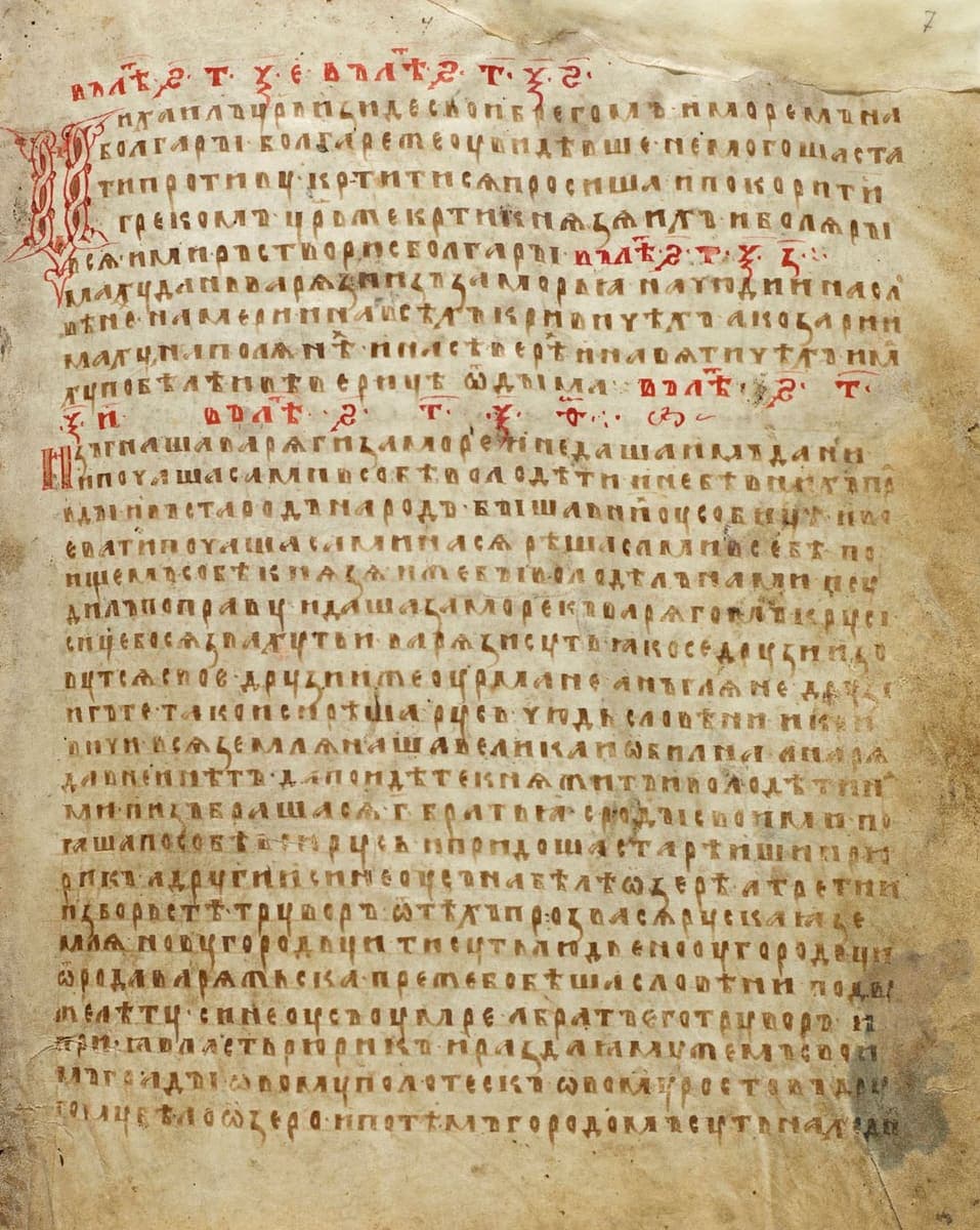
National Library of Russia, St Petersburg, F.п.IV.2, f. 7r, 1377 · Source · CC BY-SA 4.0 · Nikolay Omonov
Evidano Transcription
в лѣт[о] · ҂ѕ҃ · т҃ · ѯ҃ · е҃ · в лѣт[о] · ҂ѕ҃ · т҃ · ѯ҃ · ѕ҃ ·
Михаилъ ц[а]рь изиде с вои[?] брегомъ и моремъ на
болгары · болгаре же оувидѣвше не могоша ста
ти противу · кр[с]титисѧ просиша и покорити
грекомъ · ц[а]рь же кр[с]ти кнѧзѧ ихъ и болѧры
всѧ · и миръ створи с болгары · в лѣт[о] · ҂ѕ҃ · т҃ · ѯ҃ · з҃ ·
Имаху дань варѧзи изъ заморьꙗ на чюди и на сло
вѣнехъ · на мери и на всѣхъ кривичѣхъ · а козари и
маху на полѧнѣхъ · и на сѣверѣ · и на вѧтичѣхъ · има
ху по бѣлѣ и вѣверицѣ ѿ дыма · в лѣт[о] · ҂ѕ҃ · т҃ ·
ѯ҃ · и҃ · в лѣт[о] · ҂ѕ҃ · т҃ · ѯ҃ · ѳ҃ ·
Изгнаша варѧгы за море · и не даша имъ дани ·
и почаша сами в собѣ володѣти · и не бѣ в нихъ пра
вды · и въста родъ на родъ · быша в нихъ оусобицѣ · и во
евати почаша сами на сѧ · рѣша сами в себѣ · по
ищемъ собѣ кнѧзѧ · иже бы володѣлъ нами · и су
дилъ по праву · идоша за море къ варѧгомъ к руси ·
сице бо сѧ звахуть ти варѧзи русь · ꙗко се друзии зо
вутсѧ свое[?] · друзии же оурмане · анъглѧне · друзи
и гъте · тако и си · рѣша руси · чюдь · словѣни · и кри
вичи · всѧ землѧ наша велика и ѡбилна · а нарѧ
да в неи нѣтъ · да поидѣте кнѧжитъ и володѣти на
ми · и изъбрашасѧ · г҃ · братьꙗ · с роды своими · и по
ꙗша по собѣ всю русь · и придоша старѣишии рю
рикъ · а другии синеоусъ на бѣлѣ ѡзерѣ · а третии
изборьстѣ труворъ · ѿ тѣхъ прозвасѧ рускаꙗ зе
млѧ · новугородьци · ти суть людье нооугородьци ·
ѿ рода варѧжьска · преже бо бѣша словѣни · по дъ
вѣ лѣту · синеоусъ оумре · а братъ его труворъ · и
приꙗ власть рюрикъ · и раздаꙗ мужемъ свои
мъ грады · ѡвому полотескъ · ѡвому ростовъ · дру
гому бѣлоѡзеро · и по тѣмъ городомъ суть находни [cut off]
Generated by Evidano’s advanced model; not yet checked against a published edition.
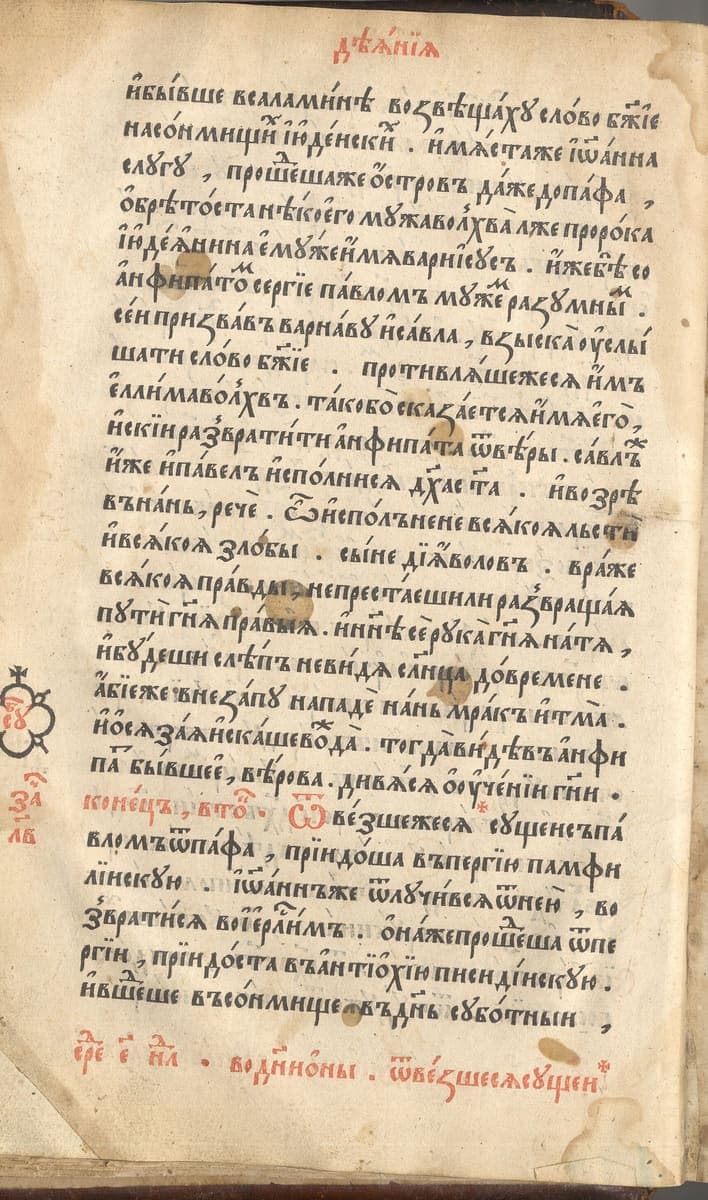
Siberian Branch of the Russian Academy of Sciences, 1564 · Source · Public domain
Evidano Transcription
дѣанїа
и бывше в саламинѣ возвѣщаху слово б[о]жїе
на сонмищи[х] іюдеиски[х] · имѧстаже іѡанна
слугу , проше[д]шаже ѻстровъ даже до пафа ,
ѡбрѣтоста нѣкоего мужа волхва лжепророка
іюдеанина єму же имѧ варїисусъ · иже бѣ со
анфипато[м] сергїе павломъ муже[м] разумны[м] ·
сеи призвавъ варнаву и савла , взыска оуслы
шати слово б[о]жїе · противлѧшежесѧ имъ
єлима волхвъ · тако бо сказаетсѧ имѧ єго ,
искїи развратити анфипата ѿ вѣры · савлже[?]
иже и павелъ исполнисѧ д[у]ха с[вѧ]та · и возрѣ
въ нань , рече · ѿ исполнене всѧкоѧ льсти
и всѧкоѧ злобы · сыне дїаволовъ · враже
всѧкоѧ правды , не престаешили развращаѧ
пути г[оспод]нѧ правыѧ · и н[ы]нѣ се рука г[оспод]нѧ на тѧ ,
и будеши слѣпъ не видѧ с[о]л[н]ца до времене ·
абїеже внезапу нападе нань мракъ и тма ·
и ѡсѧзаѧ искаше во[ж]да[?] · тогда видѣвъ анфи
па бывшее , вѣрова · дивѧсѧ ѡ оученїи г[оспод]ни ·
конецъ , вто[рникъ] · ѿвезшежесѧ сущеи съ па
вломъ ѿ пафа , прїидоша въ пергїю памфи
лїискую · іѡаннъже ѿлучивсѧ ѿ неи , во
звратисѧ во ієр[уса]лимъ · ѻнаже проше[д]ша ѿ пе
ргїи , прїидоста въ антїохїю писидїискую ·
и вше[д]ше въ сонмище въ д[е]нь суботныи ,
ср[е]д[а] є н[едѣ]л[и] · во д[ни] ѡны · ѿвезшесѧ сущен[?]
за[чало]
лв
Generated by Evidano’s advanced model; not yet checked against a published edition.
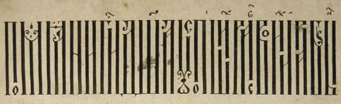
Source · CC BY-SA 4.0 · Nikolay Omonov
Evidano Transcription
The whole line, read out in modern Russian spelling and word division on the Commons file page. The vyaz itself carries no word spaces and abbreviates under titla, so the reading supplies both.
Помяни, Господи, душа усопших раб Своих и рабынь
Source: File description, “Calligraphic Original of 1604 01.jpg”, Wikimedia Commons (CC BY-SA 4.0).
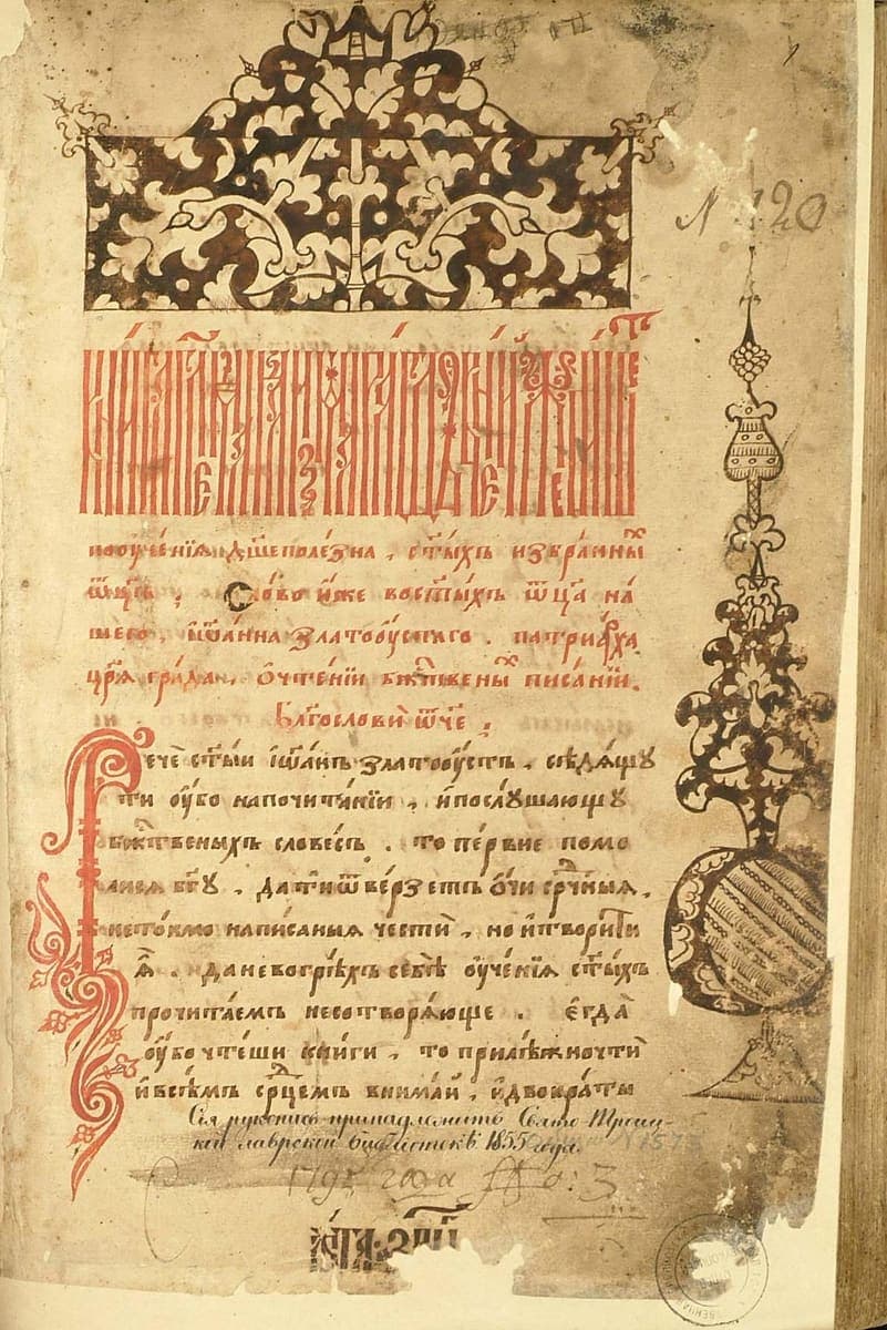
Russian State Library, Moscow, f. 304.I, no. 202, early 17th century · Source · CC BY-SA 4.0 · Nikolay Omonov
Evidano Transcription
Л 120
[vyaz title illegible]
пооученїа д[у]шеполезна , с[вѧ]тыхъ избранны[х]
ѿц[ь] ; Слово иже во с[вѧ]тыхъ ѿца на
шего , іѡанна златоустаго · патрїарха
ц[а]рѧ града , ѡ чтенїи б[о]жтвены[х] писанїи ·
Благослови ѿче ;
Рече с[вѧ]тыи іѡаннъ златоустъ , сѣдѧщу
ти убо на почитанїи , и послушающу
б[о]жтвеныхъ словесъ , то первие помо
лисѧ б[о]гу , да ти ѿверзетъ ѻчи ср[д]чныѧ ,
не токмо написаныѧ чести , но и творити
ѧ , да не во грѣхъ себѣ оученїа с[вѧ]тыхъ
прочитаемъ не сотворѧюще · єгда
оубо чтеши книги , то прилѣжно чти
и всѣмъ ср[д]цемъ внимаи , и двократы
Сія рукопись принадлежитъ Свято-Троиц-
кой лаврской библіотекѣ 1855 года.
№ 1575[?]
1795 года №о: 3
[shelf mark illegible]
[stamp]
Generated by Evidano’s advanced model; not yet checked against a published edition.
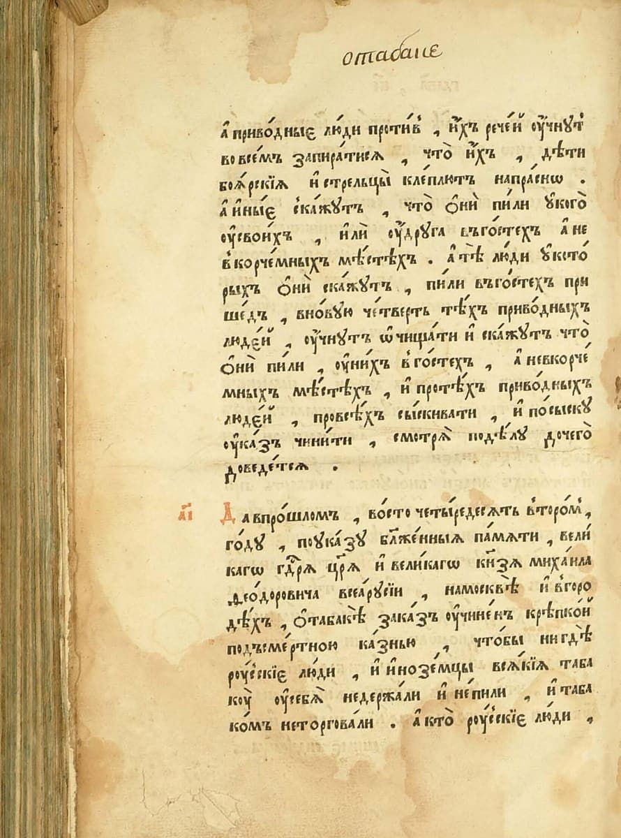
Russian State Library, Moscow, 1649 · Source · Public domain
Evidano Transcription
Article 11 of chapter XXV, which begins in the lower half of the page; the upper half carries the end of article 10, and the article runs on to the facing page. The text is the normalised civil-type edition of 1830 in pre-reform orthography, with the proofreaders’ marked misprints corrected.
11. Да въ прошломъ во сто четыредесять второмъ году, по указу, блаженныя памяти, Великаго Государя Царя и Великаго Князя Михаила Ѳеодоровича всея Руссіи, на Москвѣ и въ городѣхъ о табакѣ заказъ учиненъ крѣпкой подъ смертною казнію, чтобъ нигдѣ Рускіе люди и иноземцы всякіе табаку у себя не держали и не пили, и табакомъ не торговали.
Source: Соборное уложение 1649 года, гл. XXV, in Полное собрание законов Российской империи, ser. 1, vol. I (St Petersburg, 1830), via Russian Wikisource (Public domain).
Poluustav, vyaz and the first printed books
From the late fourteenth century the drawn letters of ustav give way to poluustav, a smaller and quicker book hand. Its letters lean, vary in width and reach above and below the line; the pen is lifted less often, and abbreviation becomes routine rather than reserved for sacred words. Endings are commonly written above the line as superscript letters, sometimes under a curved cover, so a word on the page can be missing its last two or three letters. The hand held the field for three centuries, and when Ivan Fyodorov and Pyotr Mstislavets cut type for the Moscow Apostol of 1564 they copied a Moscow poluustav so faithfully that an early printed page and a manuscript page are hard to tell apart.
Above the text sits vyaz, the display script of headings and title lines. Its aim is to fill a fixed width evenly, and it does so by fusing letters together: two neighbours share a single vertical mast, a small letter is nested inside the bowl of a large one, others shrink to half height or hang from a crossbar. A three-word title can end up as a row of identical uprights whose only distinguishing marks are the hooks, loops and strokes at top and bottom. Vyaz is almost always laid in cinnabar, is read by counting masts and matching the surviving diagnostic strokes, and often carries a superscript titlo of its own.
The rest of the page follows the same logic. A woodcut or drawn headpiece marks a new book or chapter; a large flourished initial opens the first line; chapter and article numbers stand in the margin as letters with titla; rubrics run in red, requiring a second pass through the press in printed books, which sometimes leaves them slightly out of register. Paper has replaced parchment, so watermarks and ink burn-through appear, and by the time such a book reaches a modern library its blank spaces have collected ownership inscriptions in cursive, library stamps and pencilled numbers.
Why ordinary OCR struggles here
Headings with no letters to segment
In a tight vyaz line the letters no longer have edges of their own. Recognition trained on separated glyphs sees a striped pattern and returns a string of и and п. Reading the line means working out which masts are shared and which small forms sit inside larger ones, then testing the result against the text below.
Letters lifted out of the word
Poluustav writes endings above the line: a д, х, м or the sign for ся may sit over the middle of its own word, under a curved cover. Line-based recognition drops these as noise or files them as a separate line, and the word underneath comes back as a truncated stem.
Print that behaves like manuscript
Early Cyrillic type carries the same ligatures, superscripts and abbreviations as the hand it imitates, and its red rubrics are printed separately and can sit a millimetre off. Layout analysis built for modern typography splits the two colours apart and loses the order of a page where a red line introduces a black one.
Four centuries of additions
A seventeenth-century codex often carries a donation note in skoropis along the lower margins, a later library inscription, a stamp and a modern shelf number on one opening. These belong to the history of the book, not to its text, and a transcription that runs them together serves neither.
Who works with this material
Codicologists and manuscript cataloguers
Describing a seventeenth-century codex means reading its heading, its incipit and its colophon, and separating the scribe’s work from later owners’ notes. A transcription of the first and last openings answers most catalogue questions without anyone having to read three hundred folios.
Historians of the book and of printing
Comparing the Moscow Apostol with its Lviv and Ostrog successors is a matter of collating spellings, abbreviations and rubrics line by line. Machine-assisted transcription makes that collation possible across editions that no library holds together.
Church and Old Believer studies
Pre-Nikonian service books matter to Old Believer communities and to liturgical historians precisely where they differ from later ones. The differences sit in single words and endings, which is exactly what an abbreviation-aware reading preserves.
Legal and administrative historians
The 1649 code, the Sudebniki and the printed decrees are cited by chapter and article. Numbered articles in the margin have to end up attached to the right paragraph, so that a quotation can be traced to a printed line rather than to a modern edition.
Getting the best transcription
Treat the heading as a separate job
Ask for the vyaz title to be transcribed on its own, with a note of how many masts were counted and which letters were nested. Reading it against the first line of the text below is the usual way to confirm a doubtful heading, and keeping the two apart makes the check easy.
Say what to do with superscripts
Decide whether a letter written above the line should be dropped back into the word silently, marked in brackets, or reproduced in its raised position. For a searchable corpus, dropping it back is right; for a study of scribal practice, the raised position carries the evidence.
Keep red and black distinguishable
Rubrics, initials and marginal numbers are functional, not decorative. Ask for them to be tagged, so that a heading, a lection number and a chapter number stay identifiable after the colour has been flattened into plain text.
Try a page with later hands on it
The best test page is one that carries a donation inscription along the lower margins in seventeenth-century cursive. If the additions come back labelled and outside the main text, the rest of the volume will follow the same rule.
Further reading on this hand
The palaeography guides the in-app selector points to for this domain, if you want to check a transcription against the standard references.
- Cyrillic Hands: A Translation of V. N. Shchepkin's Textbook of Russian Paleography
This online scholarly translation explains the development and diagnostic characteristics of medieval and early modern Cyrillic scripts. It gives particular attention to poluustav and to decorative or ligatured writing used in headings. Letter tables and manuscript examples illustrate historical characters, titla, abbreviations, numeral forms, punctuation, and ornamental construction. It is therefore useful for manuscripts combining a relatively regular poluustav text with highly compressed vyaz display writing.
Frequently asked questions
- Can a vyaz heading really be read automatically?
- A tight heading is a reconstruction rather than a straight reading, so it comes with a confidence note. Loose vyaz, where letters merely touch, is reliable; a dense Stroganov-style line is offered as a proposal to confirm against the text below.
- How are superscript letters and titla handled in poluustav?
- A raised letter is returned to its word and a word under a titlo is expanded from context, with your choice of brackets or silent expansion. Because poluustav abbreviates far more freely than ustav, keep the brackets for the first pass at least.
- Does an early printed book need different handling from a manuscript?
- The letterforms are the same, but the red impression can sit out of register and worn type can break a letter. The prompt hardly changes, though a printed edition rewards checking one page closely and then applying the same rules to the whole book.
- Will chapter and article numbers in the margin stay with their text?
- Yes, if you ask for them explicitly. Marginal letters with titla are read as numerals and attached to the paragraph they open, which is what makes a legal text such as the 1649 code citable article by article after transcription.
- What about donation and ownership notes written in cursive?
- They are recognised as a different hand and kept in a separate block. Such notes are often the only evidence of where a book was in a given century, so they are worth transcribing, but never as part of the poluustav text above.
Related scripts and pages
Transcribe your poluustav books
Upload an opening, choose Church Slavonic Poluustav and Vyaz as the domain, and start with the page that carries the heading.