
Russian · c. 1700–1850
From Peter’s new alphabet to Pushkin’s hand
The civil type approved by Peter I in 1710 looks almost modern until і, ѣ, ѳ and a hard sign on the end of every word get in the way. The cursive beside it is harder: т is drawn like an m, and и and н differ by the tilt of one stroke.
Sample pages
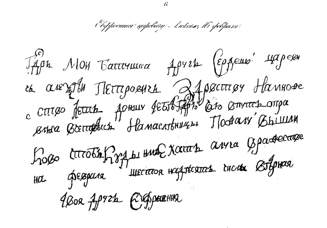
Evidano Transcription
Евфросинья царевичу. Ливорно[?], 16 февраля.
Г[осу]д[а]рь Мои батюшка другъ сердешнои цареви
чь алексѣи Петровичь Здраствуи Намноже
с ство лѣтъ доншу тебѣ г[осу]д[а]рю что отпустъ отра
влѣна всетовы[?] Намаслѣницы Пожалуи вышли
Ково чтобы Куды ни Ехать алча[?] Зрафестве
на февраля шестоя надесять числа вѣрная
твоя другъ Єфросиния
Generated by Evidano’s advanced model; not yet checked against a published edition.
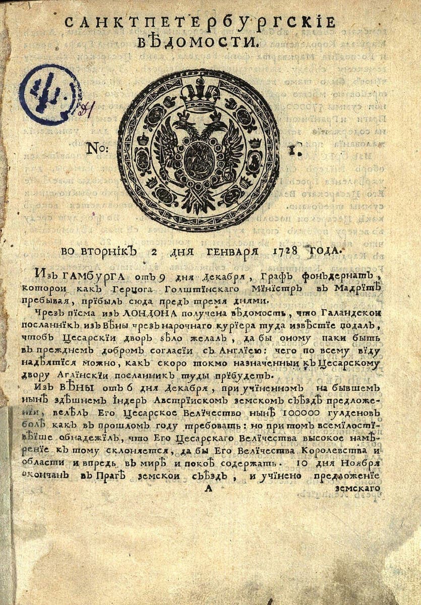
National Library of Russia, St Petersburg, 2 January 1728 · Source · Public domain
Evidano Transcription
С А Н К Т П Е Т Е Р Б У Р Г С К І Е
В Ѣ Д О М О С Т И.
No: 1.
ВО ВТОРНІКЪ 2 ДНЯ ГЕНВАРЯ 1728 ГОДА.
Изъ ГАМБУРГА отъ 9 дня Декабря, Графъ фонъдернатъ,
которои какъ Герцога Голштїнскаго Мїнїстръ въ Мадрїтѣ
пребывая, прїбылъ сюда предъ тремя днями.
Чрезъ пїсма изъ ЛОНДОНА получена вѣдомость, что Галандскои
посланнїкъ изъ Вѣны чрезъ нарочнаго курїера туда извѣстїе подалъ,
чтобъ Цесарскїи дворъ зѣло желалъ, да бы оному паки быть
въ прежнемъ добромъ согласїи съ Англїею: чего по всему вїду
надѣятїся можно, какъ скоро токмо назначенныи къ Цесарскому
двору Аглїнскїи посланникъ туды прїбудетъ.
Изъ ВѢНЫ отъ 6 дня Декабря, при учїненномъ на бывшемъ
нынѣ здѣшнемъ їндеръ Австрїискомъ земскомъ съѣздѣ предложе-
нїи, велѣлъ Его Цесарское Велїчество нынѣ 100000 гулденовъ
болѣ какъ въ прошломъ году требовать: но при томъ всемїлостї-
вѣїше обнадежїлъ, что Его Цесарскаго Велїчества высокое намѣ-
ренїе къ тому склоняется, да бы Его Велїчества Королевства и
области и впредь въ мирѣ и покоѣ содержать. 10 дня Ноября
окончанъ въ Прагѣ земскои съѣздъ, и учїнено предложенїе
А земскаго
Generated by Evidano’s advanced model; not yet checked against a published edition.
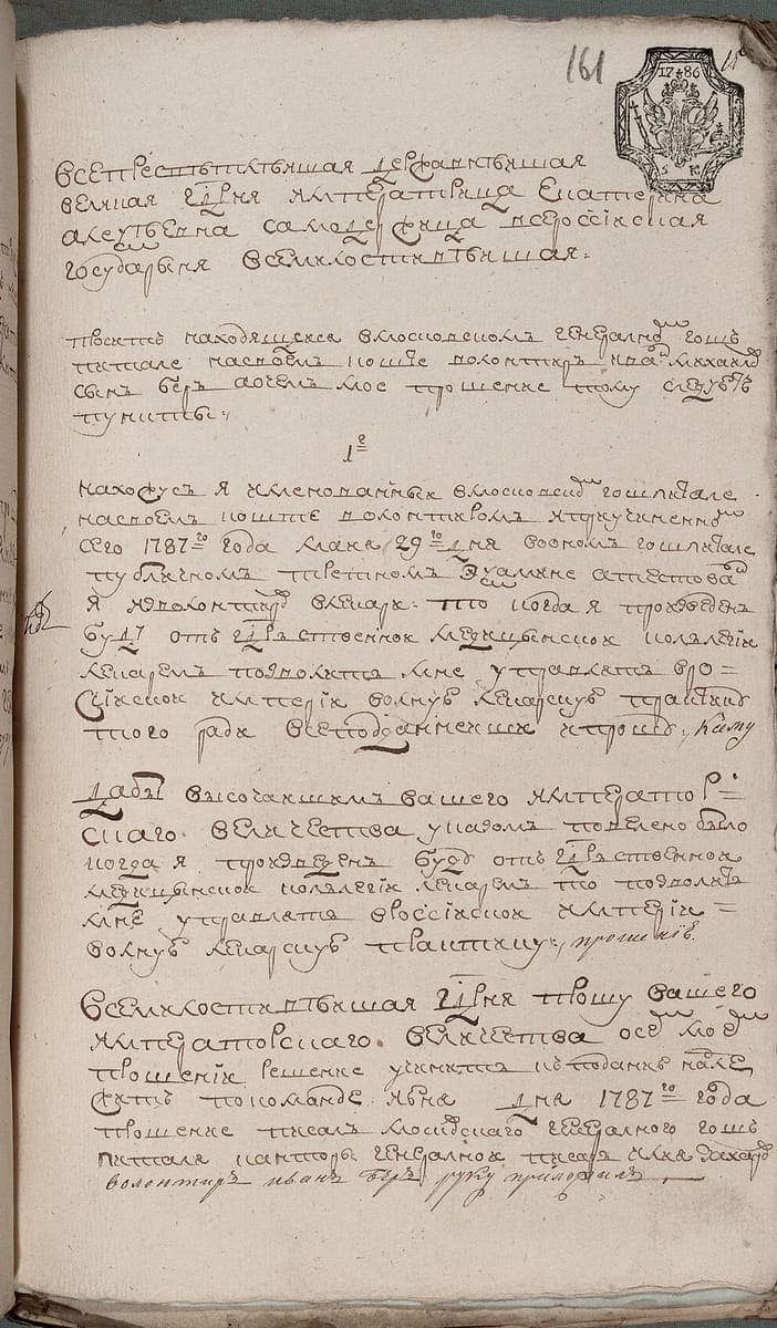
f. 344, op. 1, kn. 357, f. 161, 1787 · Source · Public domain
Evidano Transcription
161
[stamp: 17 86]
Всепресвѣтлѣишая Державнѣишая
великая Г[осу]д[а]рня Императрица Екатерина
алеѯѣевна самодержица всероссїиская
государыня всемилостивѣишая:
проситъ находящеися вмосковскомъ генералномъ гошпи=
тале насвоемъ коште волонтиръ Иванъ михаиловъ
сынъ беръ аочемъ мое прошение тому слѣдуетъ
пункты:
1-е
нахожусь я именованныи вмосковскомъ гошпитале
насвоемъ коште волонтиромъ итекущеименно[го]
сего 1787-го года маїя 29-го дня воономъ гошпитале
публичномъ третномъ Екзамене аттестованъ
я изволонтировъ влѣкари: что когда я произведенъ
буду отъ г[осу]д[а]рственнои медицинскои коллегіи
лекаремъ то позволить мне упражнятся вро=
ссїискои имперїи волную лекарскую практику
того ради всеподаннеише прошу, каму[?]
дабы высочаишимъ вашего император=
скаго величества указомъ повелено было
когда я произведенъ буду отъ г[осу]д[а]рственнои
медицинскои коллегіи лекаремъ то дозволить
мне упражнятся вроссїискои имперїи =
волную лекарскую практику; прошенїе.
всемилостивѣишая г[осу]д[а]рня прошу вашего
императорскаго. величества осемъ моемъ
прошенїи решенїе учинить. кподачю надле=
житъ покоманде: іюня [?] дня 1787-го года
прошение писалъ московскаго генералного гошпи=
таля канторы генералнои писарь Илья Захаровъ
волонтиръ иванъ беръ руку приложилъ
Generated by Evidano’s advanced model; not yet checked against a published edition.
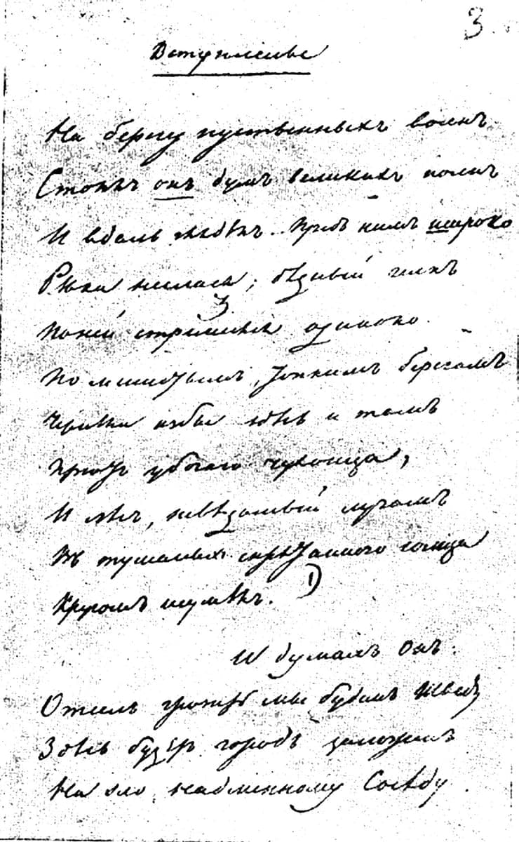
PD 964, 1833 · Source · Public domain
Evidano Transcription
Lines 1–15 of the Вступление, the whole of the page. The published text is given in modern orthography while the manuscript is in pre-reform spelling; the lineation, the italicised он and the placing of “И думал он” follow the manuscript.
На берегу пустынных волн
Стоял он, дум великих полн,
И вдаль глядел. Пред ним широ́ко
Река неслася; бедный чёлн
По ней стремился одиноко.
По мшистым, топким берегам
Чернели избы здесь и там,
Приют убогого чухонца;
И лес, неведомый лучам
В тумане спрятанного солнца,
Кругом шумел.
И думал он:
Отсель грозить мы будем шведу,
Здесь будет город заложён
На зло надменному соседу.
Source: А. С. Пушкин, Медный всадник, via Russian Wikisource (Public domain).
Source · CC BY-SA 4.0 · Zenit28, via Wikimedia Commons
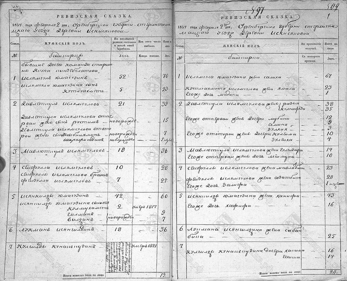
Evidano Transcription
РЕВИЗСКАЯ СКАЗКА.
1834 года февраля 2 дня, Оренбургской губерни Стерлитама
цкаго Уезда деревни Искисяновой
| Семьи. № | МУЖЕСКІЙ ПОЛЪ. | По последней ревизіи состояло и после оной прибыло. Лета. | Изъ того числа выбыло. Когда именно. | Ныне на лицо. Лета. |
|---|---|---|---|---|
| Башкирцы | ||||
| бывшие 20-го команды старшины Якупа Киндебулатова, | ||||
| 1 | Ислямгулъ Юмагузинъ | 52 | — | 70 |
| Ислямгула Юмагузина сынъ Кутлуахметъ | 5 | — | 23 | |
| 2 | Давлетшулъ Ислямгуловъ | 21 | — | 39 |
| Давлетшула Ислямгулова от первои жены сынъ Рустимъ | новорожд. | — | 15 | |
| Девлетшула Ислямгулова от второи жены сыновья Биниаминъ[?] | новорожден | — | 7 | |
| Шарафитдинъ | новорожден | — | 5 [?] | |
| 3 | Мавлютшулъ Ислямгуловъ | 18 | — | 36 |
| 4 | Сеифулла Ислямгуловъ | 10 | — | 28 |
| Сеифуллы Ислямгулова братъ Фаизулла Ислямгуловъ | 7 | — | 25 | |
| 5 | Исянкилды Юмагузинъ | 42 | — | 60 |
| Исянкилды Юмагузина сыновья Кулмухаметъ | 2 | умеръ 1817 | ||
| Гилманъ | новорожден | — | 9 | |
| Вилданъ | новорожден | — | 7 | |
| 6 | Лукманъ Исянгилдинъ | 18 | — | 36 |
| 7 | Кулгилды Кунакбузинъ[?] | [vertical note, illegible] | умеръ 1821 | — |
Итого мужеска пола на лицо 13.
897
509[?]
1
РЕВИЗСКАЯ СКАЗКА.
1834 года февраля 2 дня, Оренбургской губерни Стерлита
мацкаго уезда деревни Искисяновой
| Семьи. № | ЖЕНСКІЙ ПОЛЪ. | Во временной отлучке. Съ котораго времени. | Ныне на лицо. Лета. |
|---|---|---|---|
| Башкирки | |||
| 1 | Ислямгула Юмагузина жена Салиха | — | 67 |
| Кутлуахметя Ислямгулова жена Ямала | — | 23 | |
| Егоже дочь Мадина | — | 1 | |
| 2 | Давлетшула Ислямгулова жены Разыя | — | 38 |
| Кулнафида[?] | — | 35 | |
| Егоже от первои жены дочери Мубина | — | 12 | |
| Аминя | — | 9 | |
| Зулхия | — | 3 | |
| Егоже от второи жены дочери Кулеима | — | 10 | |
| Зулеиха | — | 4 | |
| 3 | Мавлютшула Ислямгулова жена Гулидара[?] | — | 14 |
| Егоже от первои жены дочь Мимуна | — | 10 | |
| 4 | Сеифуллы Ислямгулова жена Мавлюбика | — | 23 |
| Фаизуллы Ислямгулова жена Аватбика | — | 28 | |
| Егоже дочь Заифа[?] | — | 1 недѣл[я] | |
| 5 | Исянкилды Юмагузина жена Ханифа | — | 43 |
| Егоже дочь Хафифа | — | 16 | |
| 6 | Лукмана Исянгилдина жена Сабанбика | — | 25 |
| 7 | Кулгилды Кунакбузина[?] дочери Хапима[?] | — | 16 |
| Гашиа[?] | — | 14 |
Итого женска пола на лицо 20.
Generated by Evidano’s advanced model; not yet checked against a published edition.
Two alphabets, one century apart
Between 1708 and 1710 Peter I replaced the old letterforms for secular printing with grazhdansky shrift, a civil type cut on Latin proportions. Titla and letter-numerals went out of civil books along with several Greek-derived letters; Arabic figures came in, and dates began to be printed as numbers. The church kept its poluustav for liturgical books, so for the rest of the imperial period two alphabets ran side by side and a printer might use both in one volume. Four older letters survived the reform and stayed until 1918: decimal і, yat, fita and izhitsa, along with the hard sign written after every word ending in a consonant.
Handwriting changed more slowly and less tidily. Muscovite skoropis gave way through the eighteenth century to a cursive taught from Western copybooks, but the transition left a hand full of traps: т written as three legs like an m, д with a long looping tail, ш and т, и and н, л and п. Endings were still sometimes lifted above the line in the first half of the century, and clerks shortened ranks and honorifics with a raised letter. Official documents keep their formulae — a petition still opens by addressing the sovereign in full — and rank titles follow the Table of Ranks.
The material itself widens enormously in this period. Alongside chancery files there are newspapers from 1703, printed decrees, academic and literary books, estate and factory paperwork, and the revision tales that count the taxable population on pre-printed forms. Documents are written on watermarked paper, often on stamped sheets whose duty mark is printed in the corner; iron-gall ink bites through to the other side and prints backwards under the writing; chancery clerks add notes in the margins; and archivists number the leaves in pencil a century later.
Why ordinary OCR struggles here
Cursive letters that mimic each other
A handwritten т with three legs is a modern m; и, н, ш and щ reduce to runs of identical strokes; л and п differ by one hook. Recognition trained on modern handwriting resolves these by frequency and produces words that are plausible but wrong — worse than a gap in a surname.
Letters a modern model deletes
Decimal і, yat, fita and the final hard sign are not decoration. A model that normalises them silently loses the difference between миръ and міръ, mangles names spelled with ѳ, and produces text that no longer matches the document a reader has in front of them.
Ranks, offices and formulae
A petition opens with a long address to the sovereign, then a rank, an office and a date, much of it abbreviated with raised letters. These phrases identify the document and the person, and a model that has never seen the Table of Ranks fails on exactly the words that matter for indexing.
Printed forms with handwriting in them
A revision tale is a printed grid filled in by hand, with names in one column and ages in another and corrections squeezed between the rules. Reading it means holding the grid together, so that an age stays with the right person and a marginal addition is not merged into the row above.
Who works with this material
Genealogists working in imperial records
Revision tales, parish books and service records are the backbone of Russian family research, and all three combine a fixed printed or formulaic frame with handwritten names. Getting the names and ages out of the columns intact is most of the work.
Textual scholars and literary archives
An author’s fair copy differs from the printed text in punctuation, capitals and sometimes in words. A transcription that reproduces what is on the leaf, rather than what the edition prints, is the starting point for collation and for any account of how a poem changed.
Historians of the imperial administration
Decrees, reports and petitions carry ranks, offices and dates that have to survive intact into a database. Because so much of that information is abbreviated, a reading that expands the contractions and marks the expansions saves hours of re-checking.
Book and press historians
The first decades of civil printing are a story of type, spelling and layout changing together. Transcribing early newspapers and decrees as they were set, with the pre-reform letters kept, makes it possible to trace those changes rather than assert them.
Getting the best transcription
Decide the orthography rule first
State whether і, ѣ, ѳ, ѵ and the final hard sign are to be kept or converted to modern equivalents. Keep them for editions, quotation and name matching; convert for a rough index. Mixing the two across a file is what makes a corpus unusable later.
Supply the formulae and the ranks
Give the model the opening address of a petition, the rank titles and the office names that occur in your material, and say whether dates are old style. The formulaic parts are the most abbreviated and the easiest to get right when the model is told what to expect.
Ask for tables as tables
For a printed form, ask for the column headings first and then one row per person, with empty cells marked. That keeps an age with its name, and it makes the later insertions and marginal notes visible as what they are rather than as extra text.
Test on a page with show-through
Choose a thin sheet where the verso prints backwards through the paper, or a letter written over a printed form. If the model ignores the reversed text and the stamp, the rest of the volume will need very little correction.
Further reading on this hand
The palaeography guides the in-app selector points to for this domain, if you want to check a transcription against the standard references.
- Russian Handwriting: Introduction
This Brigham Young University guide introduces both typed and handwritten Russian alphabets, including archaic forms found in historical records. It supplies handwriting examples, alphabet resources, vocabulary, grammar, and guidance on common Imperial and later document formats. The material helps users compare printed Cyrillic with cursive shapes whose forms can differ substantially. It is useful for eighteenth- and early nineteenth-century records created after the civil-script reform but before orthography became fully uniform.
Frequently asked questions
- Are the pre-reform letters kept in the transcription?
- Yes when you ask for them. Decimal і, yat, fita, izhitsa and the final hard sign are transcribed as they stand, which matters for names and for matching a spelling across records. A modernised version comes from the same reading.
- How is eighteenth-century cursive different from modern Russian handwriting?
- The letterforms are mostly recognisable, but т is often written as an m-shape, д carries a long lower loop, capitals follow copybook models unlike anything in print, and endings are sometimes raised above the line. A model that expects modern school handwriting mis-reads all four.
- Can a revision tale be turned into a table?
- It can. The printed headings are read once and each household is returned as rows, with the ages at the previous and current revision in their own fields and marginal additions attached to the person they concern rather than to the row below.
- Will a literary manuscript be read as the poem or as the page?
- As the page. Deletions, insertions above the line and words trailing into the margin are reported where they occur, and a doubtful reading is flagged rather than resolved in favour of the printed text, which is exactly the choice a textual editor needs to make themselves.
- What about French and German words in Russian documents?
- They are common in names, titles and whole passages of correspondence. The transcription switches alphabets where the writer does and keeps the original spelling, so a Latin-script surname is not transliterated into Cyrillic by accident.
Related scripts and pages
Transcribe your imperial-era papers
Upload a decree, a petition or a revision tale, choose Imperial Russian Civil Script and Cursive, and set the orthography rule first.